Brew You Coffee Co. isn't just about waking up; it's about waking up right. It bridges the gap between the robust kick of artisanal coffee and the calming benefits of herbal infusions.
Targeting health-conscious professionals and creatives, the brand needed an identity that stepped away from the aggressive 'hustle culture' of traditional coffee shops and embraced a slower, more mindful ritual.
Most coffee brands use dark browns, blacks, and sharp, aggressive fonts to denote strength. However, Brew You is an herbal blend (gentle on the gut, anxiety-free).
The Goal: Design a visual identity that feels 'Full-Bodied' and satisfying (like coffee) but also 'Calm and Organic' (like tea). The challenge was to blend these two opposing vibes into one cohesive mark.
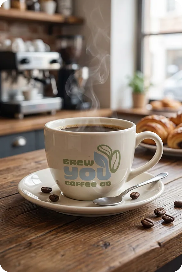
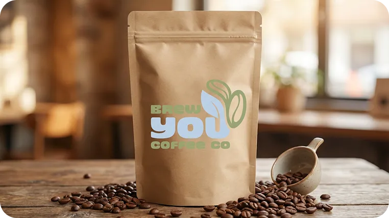
The logo icon is a mathematical fusion of a coffee bean and a tea leaf. it represents the organic growth of the plant and the precision of the roast. the geometry is soft and circular, avoiding sharp eadges to maintain that “mindful” aesthetic.
We selected a vibrant primary green to cut through the muted “earth tones” usually found in the organic aisle. it signals freshness, energy. and modern science.
Google Fonts/Approachable, Geometric.
Bold
Headlines
Medium
UI Elements
Light
Body Copy
“The quick brown fox jumps over the lazy dog.”

" “Working with the design team transformed our business from a local roaster to a lifestyle brand. The ‘mindful’ aesthetic isn’t just a look it’s how our customers feel when they hold our bag.” "

Marcus Chen
Founder, Brew You Coffee Co.