Visual Fatigue
Overcoming the generic leaf cliches prevalent in the eco-friendly sector.
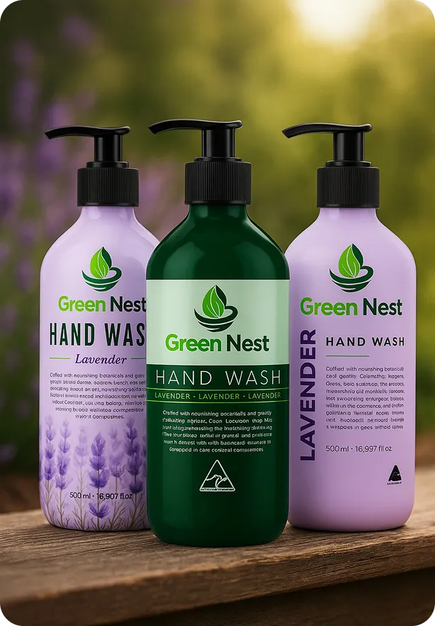
In a world filled with chemical-heavy cleaning products, Green Nest was born to offer a gentle, plant-based alternative. The brand focuses on hygiene products infused with organic ingredients like Aloe Vera, Tea Tree, and Lime.
The goal was to create a brand identity that communicates "Deep Cleaning" without the harsh "Clinical" look. It needed to feel refreshing, moisturizing, and safe for the whole family.
Supermarket shelves are dominated by clinical white and blue bottles (like Dettol or Lifebuoy). Green Nest wanted to target the premium, eco-conscious consumer.
The Brief: Design a logo that screams "Organic" and "Freshness" instantly. The visual identity had to promise that the product cleans hands but keeps skin soft and moisturized.
Overcoming the generic leaf cliches prevalent in the eco-friendly sector.
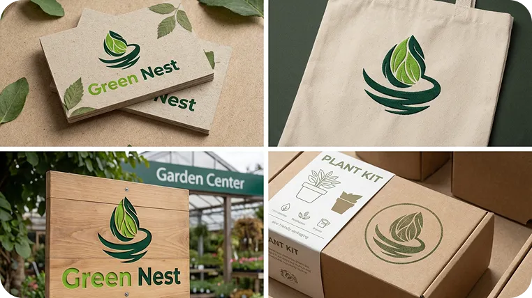
Communicating the refillable system clearly through packaging design.
balancing earth-friendly materials with a high-end luxury aesthetic.
The logo symbol combines the protective shape of a nest with the sprouting energy of a leaf. The circular motion implies the cycle of reuse and sustainability.
We selected a vibrant primary green to cut through the muted “earth tones” usually found in the organic aisle. it signals freshness, energy. and modern science.
Google Fonts/Approachable, Geometric.
Bold
Headlines
Medium
UI Elements
Light
Body Copy
“The quick brown fox jumps over the lazy dog.”

" The new identity perfectly captures the essence of our mission. it feels clean, trustworthy, and premium. since the rebrand, our direct-to-consumer sales have increased by 40%. "

Elena Rossi
Founder, Green Nest