Dark Mode First
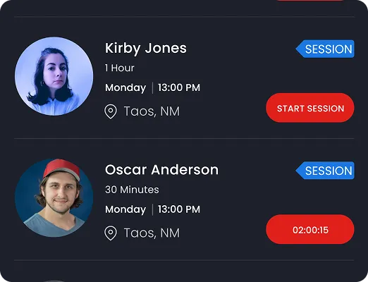
Gyms are often dimly lit with focused spot lighting. We adopted a "Dark Mode First" approach using Charcoal (#1a1f2e) and deep blacks to match the user's physical environment and reduce battery drain during long workouts.
Zing Fitness approached us with a bold vision: to disrupt the traditional gym model that locks users into long-term contracts. Their goal was to create a flexible, 'pay-as-you-go' ecosystem.
The platform needed to serve two distinct user groups simultaneously: fitness enthusiasts looking for variety without commitment, and independent personal trainers seeking to fill their schedules and manage payments seamlessly.
The fitness industry suffers from a lack of transparency. Trainers hide rates, and gyms hide cancellation policies. Zing needed to be the antithesis of this: radical transparency wrapped in a high-energy, motivational interface. The core UX challenge was designing a dual-sided marketplace (User vs. Trainer) within a single app architecture without cluttering the experience.
We approached the redesign with three core pillars.
Gyms are often dimly lit with focused spot lighting. We adopted a "Dark Mode First" approach using Charcoal (#1a1f2e) and deep blacks to match the user's physical environment and reduce battery drain during long workouts.
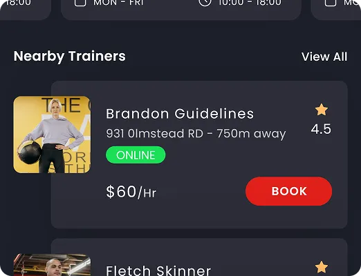
To convey energy and urgency, we utilized an Electric Red (#E62117) for primary CTAS. This color guides the eye to the most critical actions: "Book Now," "Start Session," and "Online Status."
We simplified the complex registration flow by splitting the user journey immediately at the splash screen. "I am a User" vs "I am a Trainer" sets the context for the entire subsequent UI customization.
Users can browse trainers by specialty (Crossfit, Aerobics, Strength), view real-time pricing per minute or session, and see exact distance. We prioritized information density without clutter, using card-based layouts to group critical decision-making data.
For trainers, the app serves as a business manager. The profile screen acts as a dashboard showing appointments, active trainees, and online status. The "Manage Classes" and "Edit Profile" buttons are prominent, allowing trainers to update their availability on the fly.
Achieved within the first month of beta launch, validating the marketplace demand.
Streamlined 3-click booking system drastically reduced friction for users.
Strong brand recall and intuitive dark mode UI praised by early adopters.